Ordnance Survey — News & Insights Experience

JDD editorial UX designed in Figma. Engineered by OS in-house.

Who Ordnance Survey is

Ordnance Survey is Great Britain’s national mapping service. They look after the country’s most trusted geographic database, which holds more than half a billion features and is updated as often as twenty thousand times each day. It’s a massive operation, but it has to be, because their work serves very different groups of people all at once.

On one side, government and public sector leaders rely on their data to make decisions. Businesses and enterprise partners use it to create services. Developers tap into the Data Hub to build new tools. And everyday outdoor consumers turn to the OS Maps app to plan walks, rides and adventures.

Designing for all of these people on a single platform is a unique challenge. For JDD, it meant creating a news and insights experience that felt simple, clear and useful, no matter who you were.

The Challenge

Ordnance Survey needed a news site that could talk to all of these audiences at the same time. They wanted to make it easy for people to get where they needed to go without getting lost in the noise. They also needed trust to be visible in the right moments — proof of scale, proof of accuracy, proof of credibility — sitting right next to the actions that matter most.

In short, they wanted clarity, speed, and an experience that felt natural for every type of visitor.

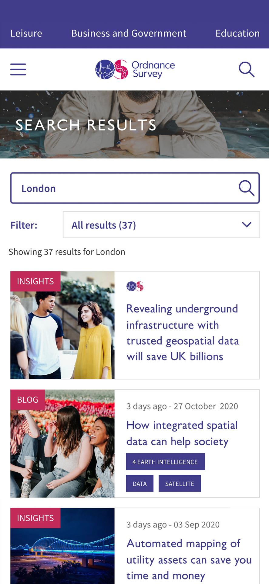
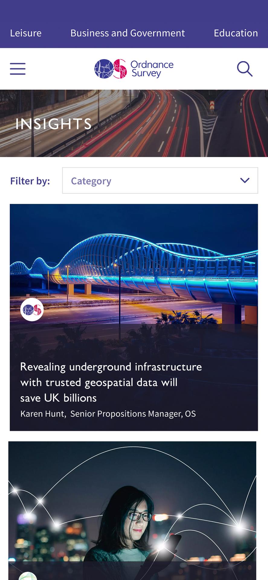
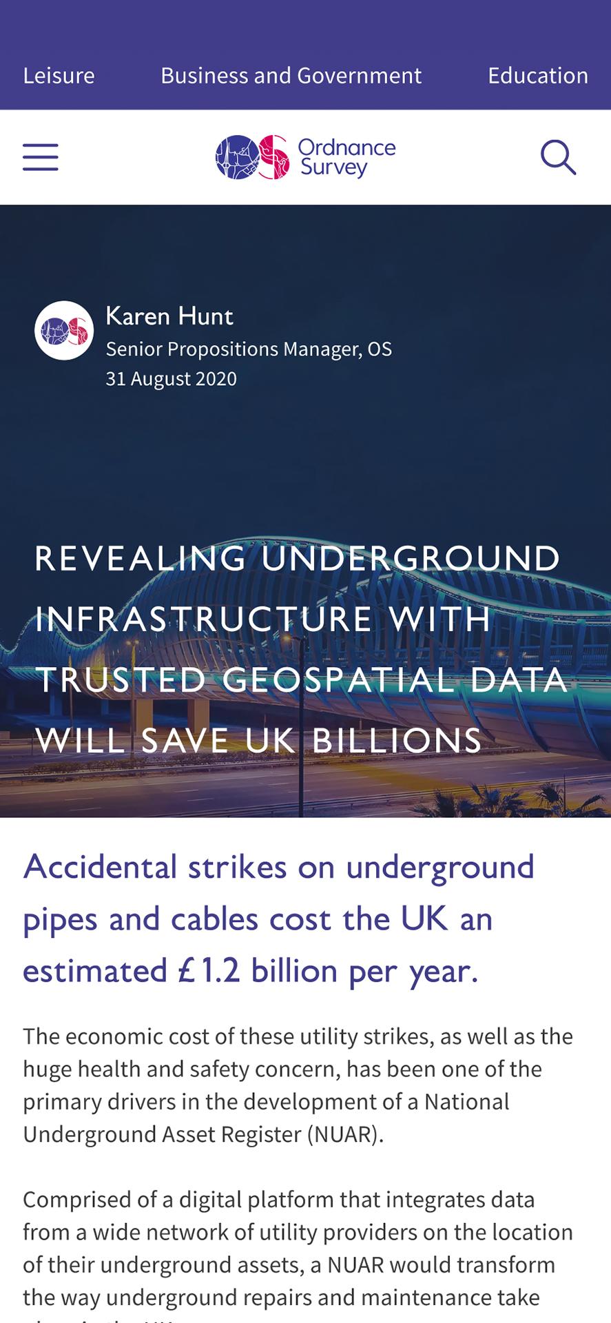
Mobile Screen
Mobile Screen
Mobile Screen
A key aspect of selecting JDD was the ability to understand and contribute to the planning and conception stage of our development. We are able to set parameters and goals of what we wish to achieve and they will help provide a logical solution in our application.
Alex Eames
Operations Director

Clear paths and confident outcomes

We made navigation simple and human. The menu now has four clear doors — Government, Business, Developers and Outdoors — so every audience can go straight to what they need.

On the homepage, we stripped back distractions and made outcomes the focus. One headline, one short proof, and two direct calls to action: “Speak to a geospatial expert” and “Start with the Data Hub.” Proof statements sit right alongside the buttons, giving people confidence to act right away.

Smarter discovery and a system that scales

For those searching through the national database, we built a guided product finder that mirrors how the data is actually organised. Developers got quick-start layouts, copy-and-paste code, and a fixed call to action to get projects moving without delay.

We also gave OS Maps a clear space to shine, showing its benefits without distracting from the business and government journeys. Behind the scenes, everything was built on a flexible design system in Figma — consistent colours, typography, spacing, and accessibility rules — so the experience looks and feels seamless while being quick to scale.

Why It Worked

This approach worked because it was built around people’s intent, not internal structures. Readers could find their next step quickly and without friction. Trust signals sat in exactly the right place, helping them act with confidence. Developers experienced a better first mile, which meant adoption rates could rise. And by giving Ordnance Survey a flexible design system, we helped their team speed up rollouts without sacrificing quality.

By making these changes, we expected developers to get from the landing page to starting a project in up to thirty percent less time. We anticipated government and business leaders would be more likely to reach out for a conversation, while bounce rates on high-intent solution pages would drop. And with clearer flows, more people could find their way into the Data Hub and OS Maps.
Proof points placed exactly where people make decisions.
Proof at the decision point — NGD scale and credibility placed next to CTAs.
A better first-mile experience for developers, which directly increases adoption.
A design system that speeds up rollouts and keeps everything consistent.

The process we followed

We began with discovery — speaking with stakeholders, reviewing analytics, and auditing content. Then we mapped the journeys of different audiences, defining what success would look like for each of them. From there, we moved into design: a system in Figma with key screens, navigation, hero modules, the product finder, developer pathways, and credibility bands.

Finally, we handed everything over to Ordnance Survey’s in-house developers, providing annotated files, accessibility notes, and guidance for testing. They brought the designs to life, while we ensured the foundation was strong, scalable and easy to maintain.

Ready to See It in Action?

We help national organisations and SMEs alike simplify complex journeys, remove friction, and build trust exactly where decisions are made.

Let's Connect

Get In Touch

Whether you have a specific project in mind or would like to find out more about how we might be able to support your business, we'd love to talk.